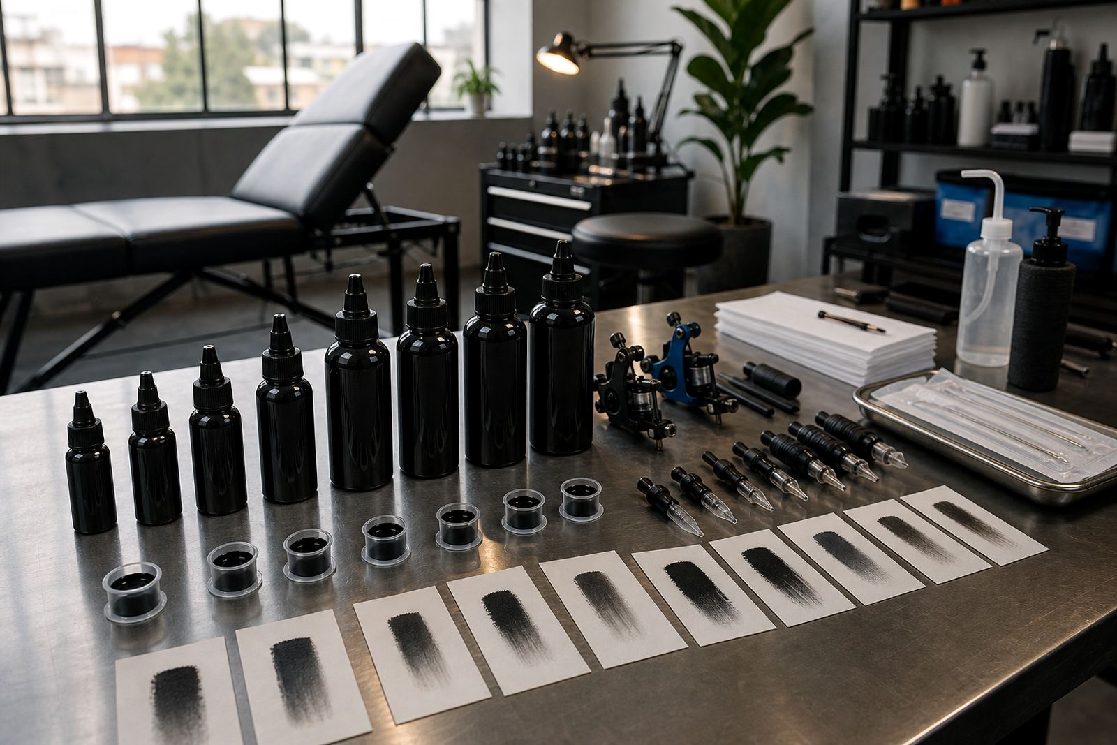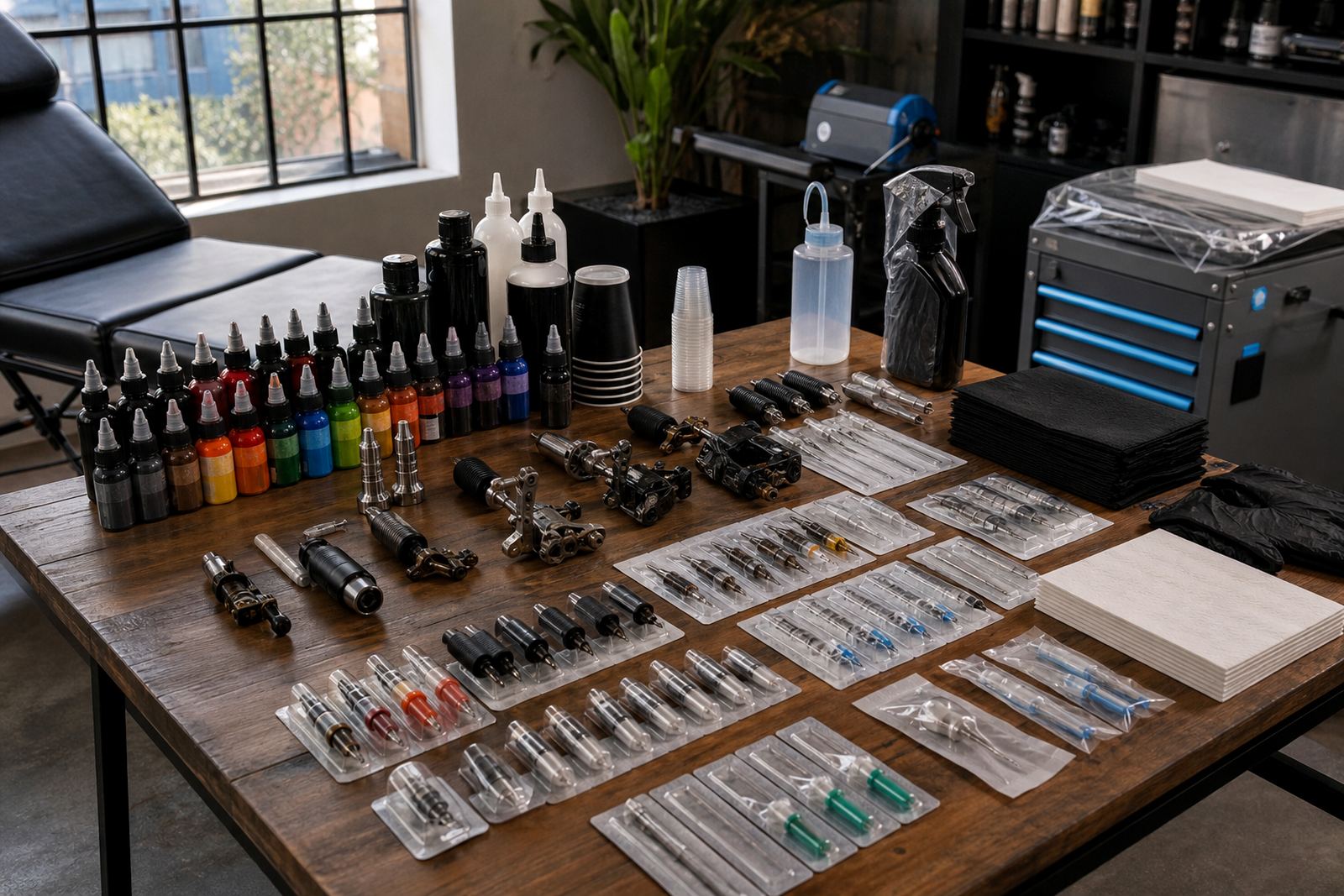

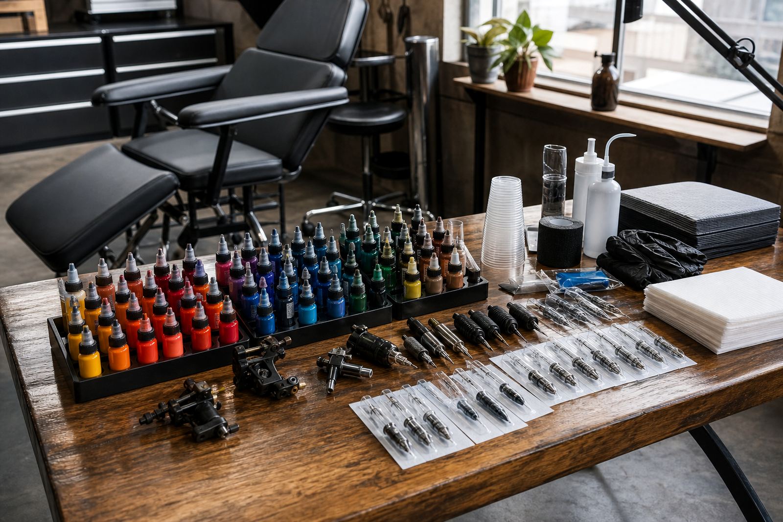
Start with the styles you fill most often
Before choosing a colour range, look at the work that leaves your station most often. A studio doing fine line pieces in Observatory will not need the same depth of colour as a team handling larger cover-up work, full sleeves, florals or bold graphic pieces. The best set is the one that covers your repeat work first, then leaves space for custom mixing.
If your bookings lean toward portraits, illustrative work or botanical pieces, choose a set with balanced primaries, a few muted tones and good darks for contrast. If you do a lot of flash, traditional work or brighter custom pieces, stronger reds, yellows, blues and greens matter more than a long list of near-identical shades. For studios serving Cape Town, Johannesburg, Durban, Pretoria and Gqeberha, it also helps to keep colour families practical for reordering and storage across different dispatch volumes.
- List the top 10 colour requests from recent work.
- Check which shades get mixed together every week.
- Separate must-have colours from nice-to-have colours.
- Keep note of the styles your artists refuse to stop using.
Build from core shades, then add support colours
A compact studio usually does better with a tight core set than with a wide shelf of little-used bottles. Start with colours that carry most jobs: black, grey wash options, white, red, yellow, blue and green. From there, add support colours that help bridge gaps, such as orange, violet, warm brown, cool brown and skin-tone helpers. That mix gives flexibility without turning the colour shelf into clutter.
For growing studios, grouping inks by use makes stock counts easier. Keep your strongest movers together and build separate groups for lining blacks, shading blacks, colour packing shades and special accent tones. In humid coastal areas like Durban and Gqeberha, storage discipline matters too. Keep lids closed, bottles upright and stock away from direct sun, warm windows and damp corners. In Cape Town’s weather shifts, that small habit helps keep bottles in better order on busy shelves.
- Core shades: black, grey, white, red, yellow, blue, green.
- Support colours: orange, violet, brown, muted pinks and olives.
- Utility colours: wash blends, highlight whites and skin-tone helpers.
- Storage check: upright, labelled and away from heat or moisture.
Match colour sets to needle and cartridge groupings
Colour choices work better when the needle and cartridge groupings suit the task. Fine groupings are useful for controlled line work, small detail and tight colour edges. Larger groupings support colour packing, smoother fills and broader shading. A studio that chooses colour sets without checking its needle and cartridge mix often ends up with bottles that are underused because the tools around them do not match the work.
If your team uses a compact machine setup, make sure the colour range suits the most common needle groupings on the table. The artist who lines with one grouping and packs colour with another needs a shelf that supports both cleanly. That means fewer random shades and more colours that fit real jobs. For studios doing machine match help or cartridge match help, this is where the ordering list becomes practical rather than decorative.
- Line work: keep colours that hold crisp edges and clean contrasts.
- Shading: include greys, muted tones and smoother transition shades.
- Colour packing: keep stronger saturation shades close at hand.
- Mixed work: choose a set that supports both outline and fill.
Plan for studio size, not wish lists
Growing studios often buy too many shades too early. A better move is to split the range into working groups. For a smaller studio, that may mean a tight palette with a few secondary colours and clear restock points. For a busier studio, the range can grow in controlled steps, adding only the shades that have a known job in the chair. That approach keeps shelves manageable and makes consumable reorders easier.
It also helps when training newer artists. A clear colour system reduces confusion during busy sessions and makes station planning tidier. If everyone knows where the main ranges sit and which colours are used for which kind of work, the station moves faster and the shelves stay in order. In a trade where single-use supplies, needles, cartridges and inks all move together, tidy grouping saves time at the right moments.
- Small studio: core colours only, plus one or two support groups.
- Growing studio: add shades only after the first range is moving well.
- Busy studio: separate fast movers from special-order colours.
- Training setup: label each group clearly for easy restocking.
Keep storage and hygiene part of the colour decision
Good colour planning is not only about shade choice. It also affects how the studio stores stock, handles open bottles and keeps the work area organised. Colour sets with too many similar shades create confusion, especially when bottles are opened quickly during a full day of bookings. Simpler grouping means less handling, less searching and cleaner shelves.
Use storage plans that suit your floor space and stock flow. Keep inks together by family, use sterile single-use supplies where required and separate clean stock from opened items. Follow local health regulations and the rules that apply to your practice, especially where public health inspections or municipal controls are in place. For studios in central Cape Town, Stellenbosch, Bellville and Somerset West, the same practical rule applies: a neat supply area makes daily work easier and less messy, even on a full booking list.
When you choose a colour set, think about how often each shade will be handled, how it will be labelled and how it will be stored once opened. That is often the difference between a tidy shelf and one that gets out of hand.
A brief checklist before you order
Before you finalise a colour range, check the real use case, the available shelf space and the artists who will work from it. Ask whether the set supports your most common styles, whether it includes enough core shades and whether it leaves room for future growth without forcing overbuying. A useful colour set should fit the studio you run now, not only the one you hope to have later.
For delivery to studios across South Africa, it also helps to keep your ordering notes clear. Separate inks, needle groupings, cartridges and other studio supplies in the same planning sheet so restocking stays simple. If you need help with stock list help, range grouping advice, seasonal restock plans or new studio kits, the right colour set can be planned with the rest of the supply list in mind.
- Does the set cover your busiest styles first?
- Are the core shades easy to reach and easy to count?
- Will the range work with your current needles and cartridges?
- Is there space for the next few colours your artists actually use?